We rewrote the interface. Not because it looked dated. Because it was actively hostile to anyone who hadn’t already used Perkoon ten times. If you tried Perkoon in the last few months and bounced - that was on us, not you. This is the apology, the autopsy, and what we did about it.
OR. Reading top-to-bottom there was no signal
which one was the right starting point.
What we shipped
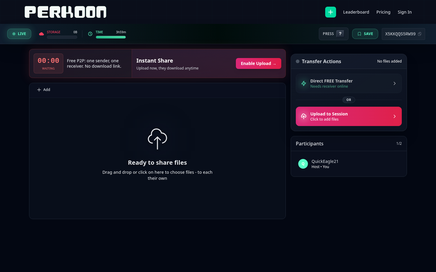
A new sender view. A new receiver view. A leaner drop zone. Fewer modals interrupting you mid-task. The cloud upgrade prompt now shows up at the moment it’s actually useful - when you’re about to leave the page and the transfer isn’t done - instead of the moment you walk in the door. Less stuff in the way. More of the thing you came here to do.
If you’ve been using Perkoon a while, the muscle memory still works. The session code is still six characters. The drop zone is still the drop zone. We didn’t move your cheese. We just stopped putting cardboard in front of it.
What we did wrong
The honest version: we kept stacking features on top of each other and never went back to ask whether the foundation could carry the weight. WebRTC connection states. OPFS save flows. Chromium-specific quirks. Compatibility banners. Retry toasts. Save-method modals. Each one solved a real problem. Together they formed a wall.
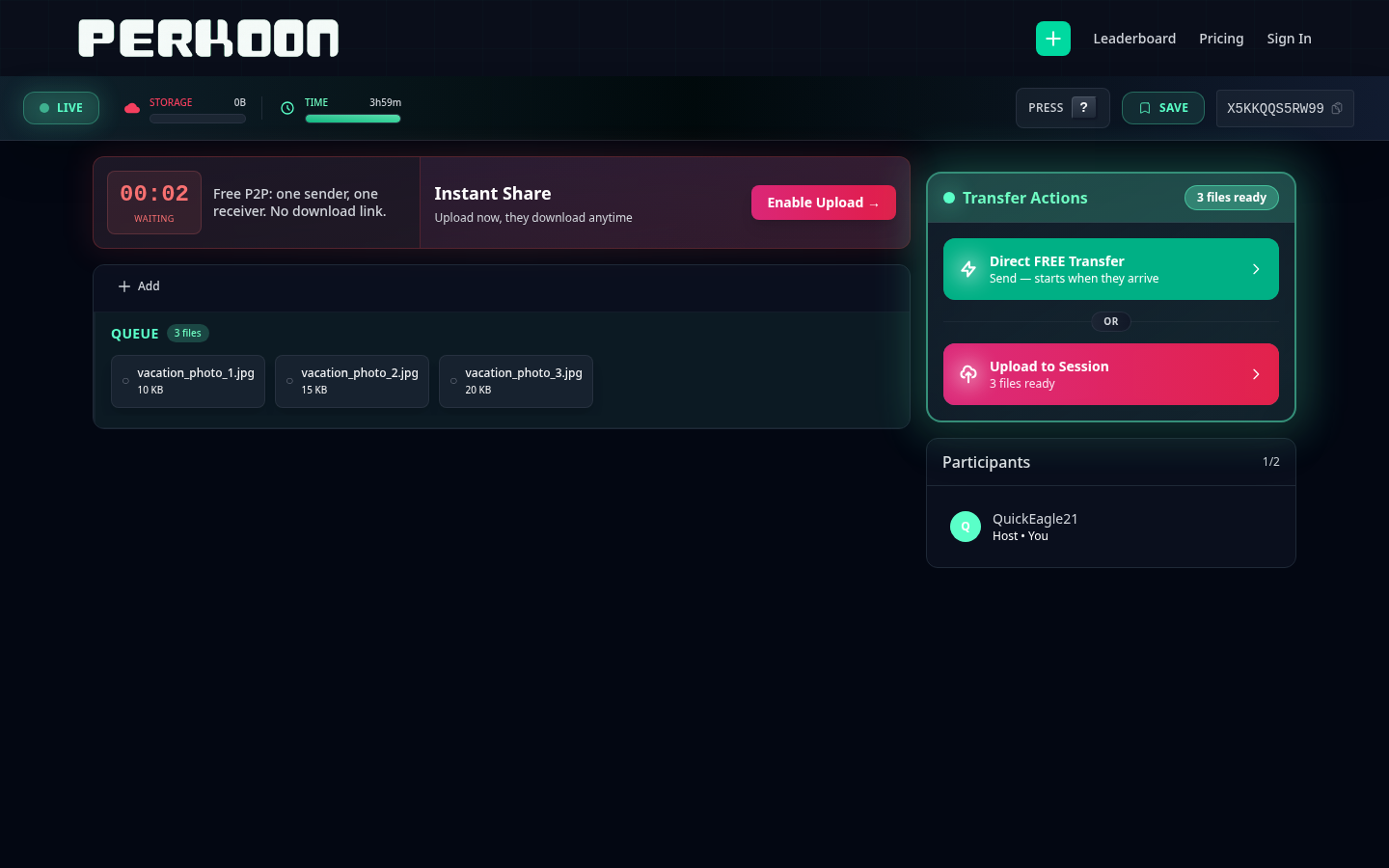
LIVE / STORAGE / TIME), header chips
(PRESS / SAVE), a session code, a 00:00 “WAITING”
countdown, an “Instant Share” upsell, an “Enable Upload” CTA,
a Transfer Actions panel with two buttons, and a Participants panel - all surrounding
a small cloud icon that was the actual drop zone.
A first-time visitor would land on the page, drop a file, and immediately get hit with three things they didn’t ask about. Browser capability warnings. Save method choices. Compatibility flow managers. Stuff that exists for a reason - but not at second one of someone’s first transfer. We were optimizing for the rare edge case at the cost of the common path. That’s the definition of over-engineering: solving problems your user doesn’t have yet in a way that prevents them from getting to the problem they actually came with.
You don’t put a fire extinguisher in front of the door. We had several.
To the people who stayed anyway
A lot of you tried Perkoon, ran into the wall, and left. We don’t blame you. We blame us.
To the dozens of you who stayed anyway - who figured out the maze, who wrote in to say the modals were confusing but the underlying thing worked, who kept using it because the P2P architecture was genuinely doing something nobody else was doing - thank you. You were patient with software that didn’t deserve your patience. You shouldn’t have had to be.
We’re sorry. The interface was getting in the way of the thing the interface was supposed to expose.
What we kept
The foundation didn’t change. P2P over WebRTC is still the default for direct one-to-one transfers - files travel browser to browser, nothing stored on our end, no size limit. The cloud tier still exists for one-to-many and real async delivery. The session model is still “leave a tab open, share a code, the receiver joins within a few hours.” That’s the part that works. We didn’t touch it.
What changed is everything sitting between you and that foundation. We pulled out the intermediaries. The compatibility manager that interrupted you to explain a problem you didn’t have yet. The save banner that asked permission for a thing that should just happen. The viral celebration hook nobody wanted. Gone. The code is in the git history if anyone wants to know what it looked like.
How we rebuilt it
The new approach is boring on purpose. One drop zone. One session code. Files appear as a list. You see what’s transferring, what’s done, what failed - in that order, in plain words, without a popover explaining what the popover means.
Perkoon’s underlying architecture is fast. P2P transfers happen at whatever speed your network can handle, which is usually faster than any cloud round-trip. The previous UI was hiding that. Six modals between you and the file did not make the file move faster - they made the experience feel slower than the bytes actually were. The new UI gets out of the way and lets the architecture do its thing.
That’s the “empowered with Perkoon tech’ part. We didn’t add new capabilities. We finally let you see the ones that were already there.
What this means going forward
We’re going to add features more carefully. The rule we’re holding ourselves to: if a feature solves a problem fewer than 1% of users hit, it doesn’t get to live in the common path. It lives behind a button, or further along the flow, or it doesn’t get shipped at all. The default experience belongs to the 99% of people who just want to send a file.
If you tried Perkoon before and it felt fiddly - try it again. perkoon.com. It’s a different thing now.
If you’ve been using it the whole time and you’re wondering whether your workflow broke - it didn’t. The session code, the drop zone, the cloud tier, the CLI, the A2A agent card - all still there, all still working the same way. We just took the cardboard down.
Thanks for sticking with us. We’re going to try to deserve it.